Colorful Dopamine Bedroom Ideas: A Cozy Maximalist Bedroom Full of Personality
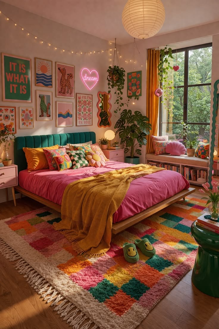
This bedroom is a strong example of dopamine decor done well.
Instead of relying on a single statement color, the room layers hot pink, teal, mustard yellow, orange, green and coral across bedding, furniture, artwork, plants and textiles. Yet despite the amount of color, the bedroom still feels warm and comfortable rather than visually overwhelming.
The best way to describe the style is:
Colorful eclectic maximalism with retro, boho and dopamine-decor influences.
It feels playful and youthful, but it is not childish. The warm wood, mature plant collection, framed artwork, upholstered headboard and carefully repeated colors give the bedroom enough structure to feel intentional.
What makes this design worth studying is that almost every surface contains personality while the room still retains a clear focal point: the bed.
Why This Colorful Bedroom Works
Bright rooms often fail when every object competes equally for attention.
This bedroom avoids that problem by giving different areas different visual roles.
The bed is the strongest block of color.
The gallery wall provides detail.
The window corner introduces plants and natural light.
The rug visually connects the entire palette.
And the warm neutral walls give all of those saturated colors somewhere to breathe.
The result is energetic without feeling completely random.
What Is Dopamine Decor?
Dopamine decor is a popular way of describing interiors designed around colors, patterns and objects that simply make the owner feel happy.
There is no strict rulebook.
Instead of following a perfectly coordinated neutral palette, dopamine rooms often feature vivid colors, quirky art, nostalgic details, unusual shapes and objects with personal meaning.
This bedroom captures that idea beautifully.
The pink bed does not need to match the orange curtain perfectly.
The floral cushions do not need to use exactly the same shades as the rug.
The artwork can combine typography, animals, flowers and abstract shapes.
The common thread is the overall emotional effect: warm, joyful, playful and personal.
Start With a Strong Bed Color
The bed immediately attracts attention because of its saturated pink bedding.
That is a clever choice because the bed is already the largest piece of furniture in most bedrooms.
Instead of trying to hide its scale with beige or white bedding, this design uses the bed as a giant color block.
A similar look could be created with bedding in:
Hot pink, raspberry, coral, burnt orange, emerald, cobalt or deep mustard.
The important point is to choose one dominant bedding color first.
Then build the rest of the palette around it.
In this room, pink becomes the foundation while mustard, teal and green function as supporting colors.
The Teal Headboard Is the Perfect Contrast
Behind the pink bed is a deep teal upholstered headboard with vertical channel detailing.
The contrast is excellent.
Pink and teal sit far enough apart visually to create energy, but both have enough depth to work together.
The upholstery also introduces softness and texture behind the pillows.
Because the headboard is relatively simple in shape, it balances the busier artwork above it.
If both the headboard and gallery wall were extremely ornate, the room could easily become too busy.
This is a useful maximalist rule:
When the color is bold, the furniture shape can remain simple.
Add Mustard to Warm Up Pink and Green
The mustard throw across the bed is one of the most important styling decisions in the room.
Without it, the combination of pink and teal might feel slightly cool.
Mustard introduces warmth and connects visually with the golden curtains beside the window.
Because the same color family appears in at least two different areas, the room feels more coordinated.
This is one of the easiest ways to make a multicolor bedroom look intentional.
Repeat major colors.
They do not need to be identical shades.
A mustard blanket can relate to ochre curtains.
A teal headboard can relate to green artwork.
A pink duvet can connect with coral prints and a pink shell cushion.
Color repetition creates order.
The Gallery Wall Makes the Room Personal
The large gallery wall is one of the defining features of the bedroom.
Rather than using matching minimalist prints, the collection combines different subjects.
There is typography, animal illustration, flowers, abstract imagery, landscapes and playful graphics.
That variety suits the eclectic style perfectly.
The frames, however, remain relatively restrained.
Light wood and simple borders prevent the wall from becoming too heavy.
If recreating this look, begin with one larger print and build smaller pieces around it.
You do not need every frame to be the same size.
In fact, variation helps create the relaxed collected-over-time appearance seen here.
Mix Typography With Illustrations
One reason the gallery wall feels interesting is that it is not made entirely from one type of artwork.
Large typography introduces graphic impact.
Illustrated animals create personality.
Floral prints reinforce the room’s natural elements.
Simple landscape or abstract pieces give the eye quieter areas.
That mixture makes the wall feel like a collection rather than a store-bought gallery-wall set.
For a truly personal room, include artwork connected to places, sayings, hobbies, music, pets or memories that matter to you.
Neon Adds a Modern Playful Detail
The glowing heart-shaped sign brings a different type of texture to the wall.
Most of the room consists of fabric, wood, paper and plants.
A neon-style light introduces something luminous and contemporary.
It works especially well after dark when the fairy lights and small lamps can create a much softer atmosphere than the main ceiling fixture.
Instead of a heart, the same idea could work with a moon, flower, lightning bolt, word, star or abstract shape.
One illuminated accent is usually enough.
Too many neon signs could make the bedroom feel more like a commercial space.
Fairy Lights Create Atmosphere
A string of warm fairy lights runs high along the wall.
This is a simple and relatively inexpensive way to soften a colorful bedroom.
The tiny lights also visually connect the gallery wall with the opposite side of the room.
Because the lights sit near the ceiling, they add interest to an otherwise unused horizontal area.
For the same warm feeling, choose soft warm-white bulbs rather than icy white or blue-toned lights.
Plants Are Essential to This Look
There are plants at several different heights.
Some hang near the ceiling.
Others sit beside the bed.
A large monstera-like plant fills the space beside the window.
More plants occupy the window bench and small surfaces.
This is important because green is not only a decorative color here.
It appears through actual living foliage.
That makes the bold color palette feel more natural.
Plants are especially effective in colorful interiors because their green tones work almost like a neutral.
They can sit beside pink, orange, yellow or teal without feeling out of place.
Use Plants at Different Heights
Instead of placing every plant on the floor, this bedroom creates vertical layers.
There are hanging plants, floor plants, bedside plants and window plants.
That draws the eye upward and makes the room feel fuller.
A good arrangement might include one large floor plant, one trailing hanging plant and two or three smaller tabletop plants.
You do not need dozens.
The goal is variation.
The Window Seat Is More Than Decoration
The built-in bench beneath the window creates a secondary destination within the bedroom.
It can function as a reading seat, plant shelf, book storage and decorative display.
The open shelf underneath holds books, which adds more color without requiring additional wall space.
This helps the room feel like more than somewhere to sleep.
It becomes a personal retreat.
If you do not have a built-in window seat, the same idea could be recreated with a low storage bench positioned under a window.
Add a seat cushion, two colorful pillows and nearby plants.
Mustard Curtains Frame the Green View
The warm mustard curtain is another excellent choice.
Outside the window is lush greenery.
Instead of introducing another green textile, the designer frames that view with golden-yellow fabric.
The contrast makes both colors stronger.
The curtain also repeats the mustard throw on the bed.
That creates a visual line between the left side of the room and the window.
In a colorful bedroom, curtains are an excellent opportunity to repeat an accent color rather than defaulting automatically to white.
The Rug Pulls Every Color Together
The large geometric shag rug is probably the most useful element for understanding the entire color scheme.
It contains several colors already used around the room:
Pink, orange, green, cream, mustard and darker accent tones.
Because all of these colors appear together in one object, they suddenly make sense together throughout the rest of the bedroom.
This is a very effective decorating technique.
When working with many colors, use one patterned textile containing most of the palette.
That textile can be a rug, quilt, curtain, oversized artwork or patterned upholstered chair.
It acts as a bridge between the different colors.
Why the Rug Is Large
The rug extends well beyond the edges of the bed.
That helps define the sleeping zone and makes the room feel comfortable.
A rug that is too small would introduce another small shape into an already detailed room.
Using a generous rug visually grounds everything.
The fluffy texture also contrasts with the smooth wooden floor and lower wooden bed frame.
The Low Wood Bed Keeps the Room Grounded
With so much happening on the walls, the simple wooden bed platform is a smart decision.
It does not introduce additional decorative carving or heavy upholstery.
Instead, the natural wood creates a quiet horizontal base beneath the bright bedding.
This is another important principle when decorating in a maximalist style:
Not every object needs to be maximalist.
Some pieces need to provide visual rest.
The simple bed frame does exactly that.
Layer Pillows Instead of Matching Them
The pillow arrangement uses several different colors, shapes and patterns.
There are florals, checks, solid velvet-like textures and a playful flower-shaped pillow.
Normally, conventional bedroom advice might suggest buying matching pillow pairs.
This room deliberately does the opposite.
Yet the pillows still work because their colors belong to the larger room palette.
A simple way to copy the look is to combine one geometric pillow, one floral pillow, one solid pillow and one novelty-shaped cushion.
Keep at least one or two colors repeated across them.
The Flower Pillow Adds Whimsy
The daisy-style pillow in the center of the bed is a small detail, but it communicates the personality of the entire room.
Not every bedroom accessory needs to be sophisticated.
One playful item can prevent a colorful room from taking itself too seriously.
Other options could include a shell cushion, fruit-shaped pillow, flower cushion, cloud, heart or checkerboard bolster.
The Room Uses Curves to Soften Straight Lines
Look around the room and there are numerous curved shapes.
The paper lantern is round.
The neon heart is curved.
The flower pillow has rounded petals.
Plant leaves introduce organic forms.
The small green side table has a curved body.
A mirror or decorative object on the wall has a wavy outline.
These shapes soften the rectangular bed, frames, window and rug.
Without them, the room would contain many rigid boxes.
Curves help make the space feel friendlier.
The Paper Lantern Is an Excellent Ceiling Choice
The large round paper lantern works especially well in a room like this.
It creates a soft sculptural presence without competing with the gallery wall.
Its pale neutral color also gives the ceiling a moment of calm.
A complicated multicolored chandelier might have been too much.
The simple paper globe is large enough to make a statement but visually light enough to disappear when necessary.
Warm Walls Prevent the Colors From Feeling Harsh
The walls are not stark bright white.
They appear closer to a warm blush-beige or very pale peachy neutral.
That subtle warmth is important.
Bright white can make saturated colors feel sharper.
A warm neutral wall softens the overall effect.
For a similar room, consider wall colors such as warm white, light peach-beige, blush cream, pale mushroom or very soft pink.
How to Build a Similar Color Palette
A useful palette inspired by this room would be:
| Role | Color |
|---|---|
| Main color | Raspberry / hot pink |
| Secondary | Deep teal |
| Warm accent | Mustard / ochre |
| Natural accent | Leaf green |
| Extra accents | Orange, coral and red |
| Base neutral | Warm cream |
| Wood | Medium natural oak |
The secret is not using every color equally.
Pink is dominant.
Teal and mustard are secondary.
Orange and green appear in smaller amounts.
Cream and wood stop the palette from becoming exhausting.
How to Make Colorful Maximalism Look Intentional
The easiest mistake is buying random colorful objects and expecting them automatically to work together.
Instead, choose a loose palette before decorating.
Then repeatedly return to those colors.
The artwork can vary.
The patterns can vary.
The furniture styles can vary.
But if the same five or six colors continue reappearing, the room develops visual cohesion.
The bedroom shown here demonstrates this beautifully.
What to Buy First
If starting from an empty bedroom, do not begin with tiny accessories.
Start with the largest surfaces.
Choose the rug.
Choose the bedding.
Choose the headboard or bed.
Choose the curtains.
Once those four pieces establish the palette, selecting art and decorative accessories becomes much easier.
Small decor should support the room rather than determine it.
How to Create the Look on a Smaller Budget
You do not need custom furniture to recreate this bedroom.
A neutral existing bed can be transformed with bright bedding.
A simple headboard can be upholstered or covered in teal fabric.
Affordable frames can be painted or left natural.
Printable wall art can build a gallery collection gradually.
Fairy lights provide inexpensive atmosphere.
Thrifted nightstands can be painted pink.
Houseplants can be propagated over time.
A colorful rug will make the largest immediate difference.
This style actually works very well with secondhand furniture because pieces do not need to match perfectly.
Use Vintage and Thrifted Pieces
An eclectic room becomes more convincing when everything does not look newly purchased from the same store.
Try incorporating a vintage bedside cabinet, secondhand vase, old books, handmade pottery or an unusual lamp.
These elements give the room history.
Even one or two thrifted pieces can make an otherwise new bedroom feel much more collected.
How to Prevent the Room From Becoming Overwhelming
Colorful maximalism still needs negative space.
Notice that the ceiling is mostly clear.
The wall background remains consistent.
The bed frame is simple.
Large portions of the bedding are one solid pink color.
The window itself provides a large visual opening.
These quieter areas allow the busier zones to stand out.
If every inch contained a different pattern, the result would be exhausting.
A Good Rule for Mixing Patterns
You can mix florals, checkerboard, stripes, abstract prints and geometric shapes if their scales are different.
For example, combine a large checkerboard with smaller floral details.
Avoid placing five tiny, equally detailed patterns beside one another.
Variation in scale is just as important as variation in color.
Make the Bedroom Feel Good at Night
During the day, sunlight provides much of the room’s energy.
At night, layered lighting should take over.
Instead of using only the ceiling fixture, combine the fairy lights, neon sign, bedside lamps and perhaps another small accent light.
This creates several pools of warm light around the bedroom.
That is particularly effective in colorful interiors because different colors become richer under low warm lighting.
How to Recreate This Bedroom Step by Step
Begin with warm neutral walls and natural wood flooring or a similar neutral floor.
Choose a large multicolor rug containing pink, orange, green and mustard.
Add a simple low wooden bed.
Use saturated pink bedding.
Place a teal channel-tufted or vertically paneled headboard behind it.
Add mustard or ochre curtains.
Layer mismatched-but-coordinated decorative pillows.
Build a gallery wall over and beside the bed.
Include one playful illuminated wall element.
Add plants at multiple heights.
Create a reading or display area beneath the window.
Finish with fairy lights, books, flowers and a few quirky personal accessories.
The goal is not to copy every object.
The goal is to recreate the layering strategy.
Who Is This Bedroom Style Perfect For?
This look works particularly well for someone who loves color and wants their bedroom to feel expressive rather than formal.
It is also ideal for Pinterest-inspired bedrooms, creative homes, Gen-Z interiors, eclectic apartments, colorful guest rooms and anyone tired of beige minimalism.
The room could easily be adapted to feel younger or more mature depending on the artwork and accessories.
A More Grown-Up Version
Keep the pink bedding, teal headboard and mustard accents.
Reduce the number of novelty pillows.
Choose more abstract or vintage-style artwork.
Replace fairy lights with elegant brass wall sconces.
Use darker wood furniture.
Keep several large plants.
The same palette can become sophisticated without losing its joyful personality.
A Softer Version
For a calmer interpretation, use dusty rose instead of hot pink.
Choose muted sage instead of teal.
Replace mustard with soft ochre.
Use a rug with cream as the dominant color.
Keep the gallery wall but leave more space between frames.
The room will retain the same personality with a softer overall energy.
A Bolder Version
If you want even more maximalism, consider painting one wall a dusty pink or warm peach.
Add a patterned ceiling light.
Introduce one striped furniture piece.
Paint a nightstand orange.
Add more decorative ceramics and books.
But continue repeating the existing palette instead of introducing five completely new colors.
Final Thoughts
This bedroom succeeds because it is colorful without being careless.
The pink bedding gives the room its identity.
The teal headboard provides contrast.
Mustard curtains and bedding add warmth.
Plants introduce natural green.
The gallery wall expresses personality.
The patterned rug brings almost every color together.
And warm wood and creamy walls prevent the whole design from becoming visually exhausting.
It is an excellent example of how a bedroom can feel joyful, creative and highly personal while still looking thoughtfully designed.
If you love interiors that feel lived-in, expressive and slightly nostalgic, this combination of dopamine decor, retro color, eclectic art and cozy maximalism is worth saving.